How I Built Tooltips That Don’t Break
Tooltips seem simple, but building ones that workacross layouts, triggers, and devices isn’t. Here’s how I rebuilt mine for control and reliability
When building a commercial application, speed is everything. For that reason, developers will always favor native, out-of-the-box solutions over fully custom ones, even if it means using a few quick hacks to meet specific requirements.
The Tooltip Problem
So when I realized I needed tooltips in my app, the first place I looked was HTML’s native title attribute. I had basically zero experience implementing tooltips, but I knew from prior work that for most common UI elements, there are usually three main options:
Use a native browser feature (like
title)Import a UI library or headless component system (like
shadcn/ui)Build your own from scratch
Comparing the Options
To figure out which option made the most sense for my use case, I first needed to understand their pros and cons. Here's the breakdown.
| Feature / Criteria | Native HTML Tooltip (title attr) | Component Library (e.g. shadcn/ui) | From Scratch (Custom-Built) |
| Styling Capabilities | No styling allowed, appearance is controlled by the browser | Fully customizable via className or theme overrides | Total control, but requires manual styling |
| Trigger Control | Always shows on hover/focus, no configuration | Configurable (hover, focus, click) depending on the library | Any trigger supported full control via props or handlers |
| Positioning Control | Default browser positioning, no adjustments possible | Often includes built-in logic like flipping or offsetting | Customizable via positioning libraries or manual logic |
| Touch Device Support | Unreliable or completely broken on mobile | Varies, better with libraries that consider mobile UX | Can be handled properly, but requires testing across devices |
| Rich Content Support | Plain text only, no HTML, no formatting | Allows JSX/HTML inside, including links, images, and interactivity | Full flexibility, render anything you want |
| Ease of Use / Setup | Just add a title attribute, zero effort | Moderate setup depending on the framework and docs | Slower initial setup, but predictable once built |
| Accessibility | Basic accessibility out of the box (screen reader reads title) | Typically built with ARIA roles and keyboard support in mind | You need to handle ARIA, focus, keyboard behavior manually |
| Dependencies / Bundle | None | Adds some weight, especially if part of a broader UI library | No external deps unless you bring in positioning or animation libs |
| Custom Behavior | Not possible | Sometimes extendable, depending on API | Totally customizable, but every feature has to be built intentionally |
My goal with tooltips in this application was to make them customizable and reusable. I wanted to easily create and plug-in different tooltip types for different use cases, each with its own styling, positioning, and data, while still behaving predictably and reliably.
What I had in mind looked something like this:
<TooltipWrapper
  type="moreInfo"
  options={options}
>
  <a href="#">Hover me</a>
</TooltipWrapper>
This is completely outside the realm of what vanilla HTML is capable of, but perfectly doable with most tooltip libraries out there. The limitations start to show if, for instance, I wanted to fetch user data, treat it, and display it as an image and some text, all from within the tooltip component.
You could argue this is an extreme edge case, or that I could just fetch and prepare all the data in the parent component beforehand. And honestly, those are both valid criticisms.
Still, I'd rather implement a complete solution upfront than go through the trouble of dealing with tooltips again later. You have to choose your battles, and for better or worse, this was the choice I went with.
Initial Implementation
Now for the trickiest part: the wrapper.
My initial implementation of the tooltip wrapper accepted the following parameters:
children(required): The anchor element or component that the tooltip is attached to.position(optional, default = "top"): Where the tooltip should appear relative to the anchor.className(optional, default = ""): Tailwind utility classes for styling the wrapper element.tooltipType(optional, default =DefaultTooltip): The custom tooltip component used to render the content.data(required): The actual data passed to the tooltip, ranging from raw text to functions and everything in between.
The wrapper itself was styled with position: relative so the tooltip could be positioned inside its bounds. It returned the following structure:
<div className="relative group" ref={wrapperRef}>
  {children}
  <TooltipComponent
    ref={tooltipRef}
    data={data}
    className={`fixed z-[9999] opacity-0 group-hover:opacity-100 pointer-events-none ${className} ${getTranslateClass()}`}
    style={{ top: tooltipPosition.top, left: tooltipPosition.left }}
  />
</div>
This layout allowed the tooltip’s position to be calculated like this:
const updateTooltipPosition = () => {
  if (wrapperRef.current && tooltipRef.current) {
    const wrapperRect = wrapperRef.current.getBoundingClientRect();
    const tooltipRect = tooltipRef.current.getBoundingClientRect();

    const positions = {
      top: {
        top: wrapperRect.top - tooltipRect.height,
        left: wrapperRect.left + wrapperRect.width / 2 - tooltipRect.width / 2,
      },
      bottom: {
        top: wrapperRect.bottom,
        left: wrapperRect.left + wrapperRect.width / 2 - tooltipRect.width / 2,
      },
      left: {
        top: wrapperRect.top + wrapperRect.height / 2 - tooltipRect.height / 2,
        left: wrapperRect.left - tooltipRect.width,
      },
      right: {
        top: wrapperRect.top + wrapperRect.height / 2 - tooltipRect.height / 2,
        left: wrapperRect.right,
      },
    };

    setTooltipPosition(positions[position]);
  }
};

useEffect(() => {
    updateTooltipPosition();
    window.addEventListener("resize", updateTooltipPosition);
    return () => {
      window.removeEventListener("resize", updateTooltipPosition);
    };
}, [position]);
The wrapper naturally wrapped around the anchor component, meaning it would never be larger than the anchor itself. This setup ensured the tooltip could be absolutely positioned in relation to its parent without weird overflow or layout issues.
One important limitation: this version didn’t support click-based tooltips. Since everything was triggered on hover, a simple group class on the wrapper combined with group-hover was enough to control visibility.
Instead of hard-setting the tooltip’s position with fixed values per direction, I kept it neutrally placed and used a translation based on the desired direction. That way, it could animate smoothly from its origin point:
const getTranslateClass = () => {
  const translations = {
    top: "group-hover:-translate-y-4",
    bottom: "group-hover:translate-y-4",
    left: "group-hover:-translate-x-4",
    right: "group-hover:translate-x-4",
  };
  return translations[position];
};
The result was a customizable, modular tooltip that popped in and out of view with smooth transitions on hover.
Where It Fell Short
It didn’t take much testing to realize how deceptively complicated tooltips can be. Here are the two main ways they didn’t behave as expected in this version:
Positioning:
The tooltip’s position wasn’t dynamic, it didn’t track layout changes in real time. Once the anchor element moved (due to a resize, animation, or DOM change), the tooltip often stayed stuck in its original spot, floating somewhere random on the screen. That made it completely unreliable. This happened because I was only recalculating its position on window.resize, ignoring internal layout shifts entirely.
tooltip mispositioned after layout change

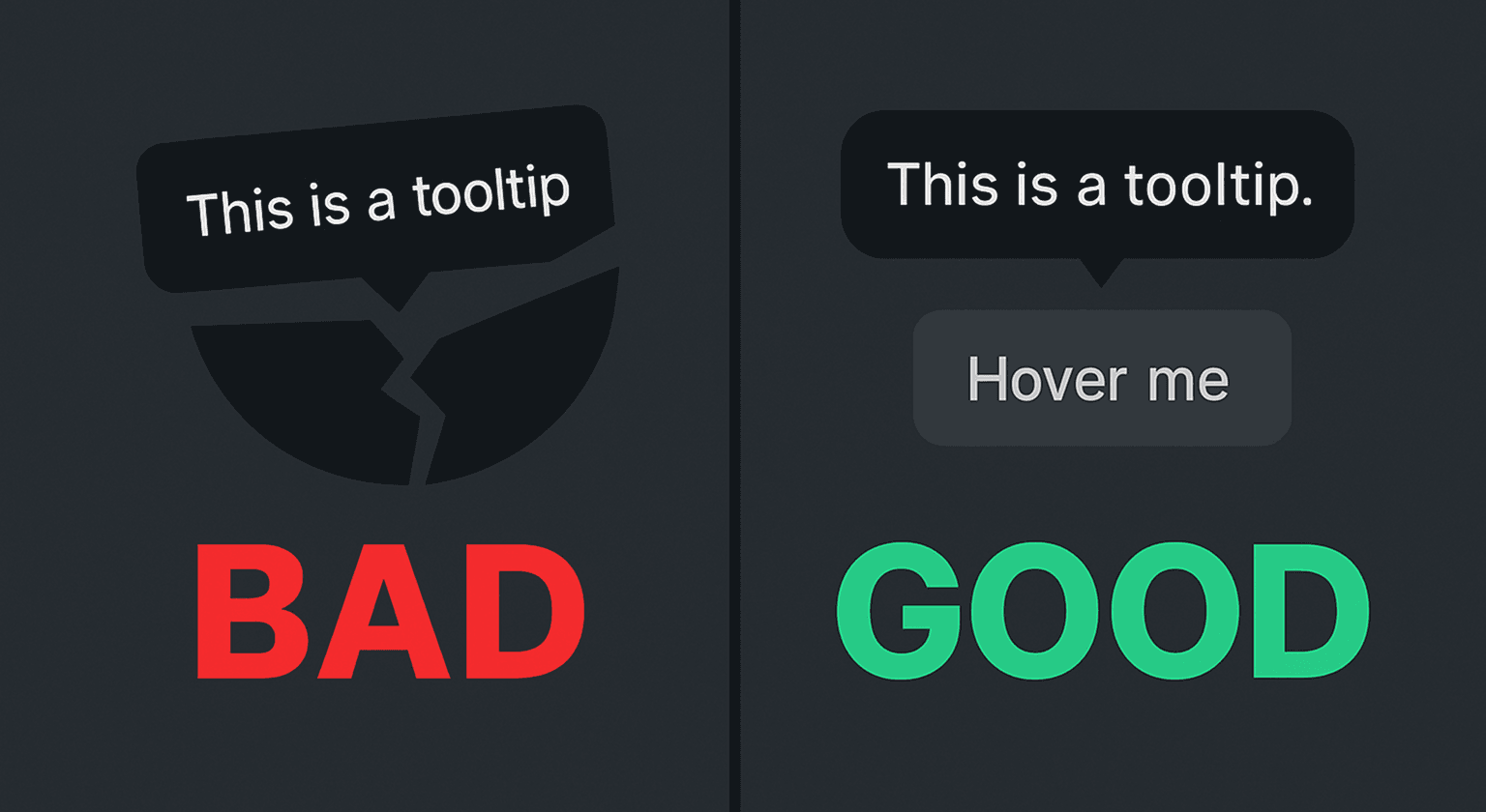
Visibility / Display:
The tooltip component was always present in the DOM, even when it wasn’t visible. It stayed hidden using CSS (opacity: 0 and pointer-events: none), but never actually unmounted. That meant it was still detectable when inspecting the DOM, and sometimes even interfered with hover and click behaviors. This happened because I never tied its presence to a true visibility state, I was only toggling styles, not whether it should exist at all.
tooltip "shadow" still visible in the DOM

Switching to Floating UI + Framer Motion
Confronted with these issues, my options were twofold: I could either stick with the full DIY implementation and fix its problems individually, or look for a more established solution. Taking performance and long-term reliability into account, I ended up going with the second. If I was going to over-engineer this, I might as well do it the right way.
It didn’t take long to find Floating UI (formerly Popper), a general-purpose abstraction for handling floating positioning. That was perfect because unlike fully pre-built tooltip components, Floating UI wouldn’t confine me to rigid designs or assumptions. I’d get the flexibility I wanted, at the cost of writing a bit more code to set up.
I also decided to offload transitions and animation to Framer Motion, since it gives you more control over the animation flow.
Final Version Breakdown
With the new version in place, here’s a summary of what changed and why:
No need for
ResizeObservers oruseEffecthacks to track anchor position, Floating UI now handles dynamic positioning automatically usingautoUpdateand element refs.Transitions are now handled by Framer Motion, so all Tailwind transition classes were removed.
The tooltip component is now conditionally mounted with
AnimatePresence, fixing the old “invisible but still in the DOM” issue.New wrapper parameters:
delay: optional animation delay (default is0.5)disabled: disables tooltip triggers entirelyopenOn: defines the trigger action (clickorhover)
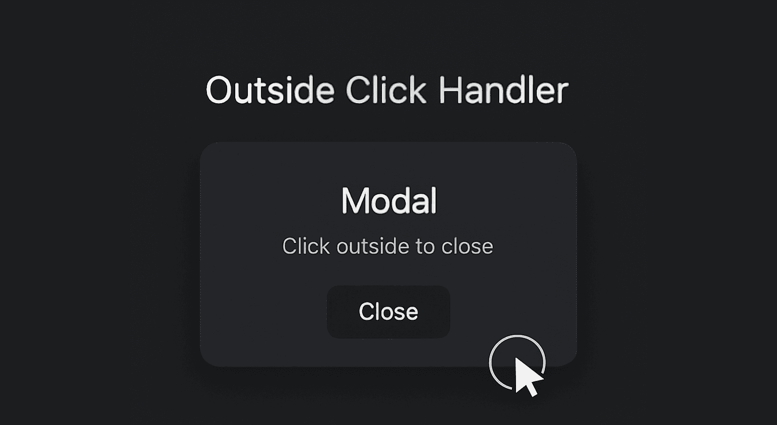
Tooltips triggered by clicks are now dismissed via an
OutsideClickHandler.
Here’s a high-level overview of how the new tooltip system works in practice:
Anchor elements are wrapped in
TooltipWrapperand passed custom parameters based on need.<TooltipWrapper tooltipType={CustomTooltip} position="bottom" openOn="click" delay={0.1} data={{ text: "Hi!" }} > <button>Click me</button> </TooltipWrapper>The wrapper handles trigger detection, positioning, visibility, and state, and displays the desired tooltip component. If none is specified, it falls back to
DefaultTooltip.{open && ( <motion.div ref={refs.setFloating} initial={{ opacity: 0, scale: 0.9, ...pullAway }} animate={{ opacity: 1, scale: 1, x: 0, y: 0 }} exit={{ opacity: 0, scale: 0.9, ...pullAway }} transition={{ duration: 0.2, delay, ease: "easeInOut" }} style={{ position: strategy, top: y ?? 0, left: x ?? 0, }} className="z-[9999] pointer-events-none" > {React.createElement(tooltipType, { data })} </motion.div> )}Tooltip components themselves can be as simple or complex as needed, making them easy to reuse and tailor per use case.
 const DefaultTooltip = forwardRef(({ data, className = "", style }, ref) => (
   <div ref={ref} className={`tooltip-default ${className}`} style={style}>
     {data.text}
   </div>
 ));
Although the changes are somewhat drastic under the hood, the result is visually the same. The real difference is in consistency, reliability, and long-term flexibility. This version doesn’t break on layout shifts, doesn’t leave ghost tooltips behind, and provides full control over when, how, and what gets rendered.
Source code
The full code for both tooltip versions is available here.